[Recently in a meeting with a local candidate, the question of name size on yard signs came up, and I was reminded of a tiny early business of mine (still described in the first two “Guerilla Marketing” books). This business was to put up posters on poster boards all around the San Francisco Bay Area. Because of that job and thousands of hours’ experience standing in front of poster boards, I learned what causes passers-by to actually SEE a sign/flyer/poster. My early rules apply just as powerfully to lawn signs today.]
Most people (and marketing books) overlook the fact that before anyone can read your (poster, yardsign, advertisement, headline), you must first “CATCH THEIR EYES.”
In any environment where other things are competing for the human’s attention, the raw size (and sometimes color) of your sign/headline/name is often the simple best way to ensure that YOUR sign is seen. And when your sign is seen MORE, then any other signs are seen LESS.
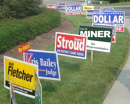
Let me prove it now … as you look at this photo …
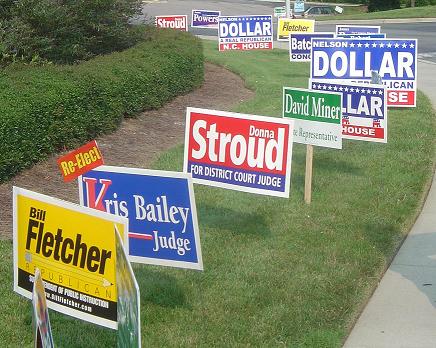
Yard Signs Near and Far
There’s a Lot You Can Observe
Mostly, people see lawn signs while they’re driving, so unless they are really foolish drivers, they only have a moment, a quick glance, to see what it says. The primary purpose of a yard sign being to build name-recognition, it means you only have a moment for them to see your name.
In the photo, you will notice that you see/notice/read the signs for Dollar and Stroud, and the others tend to not be seen, for the simple reason that your eyes are on Dollar or Stroud.
You notice that you can see Fletcher’s yellow sign when it’s nearby. (Yellow is the color to which the human eye is most sensitive.) But the far sign for Fletcher is only a yellow blur, and you don’t see the name at all, although you can easily see the name Dollar which is further away, beyond the distant Fletcher Sign.
You notice that a short name, or a single name, also has an advantage, for the same reason. It is bigger in the visual field. You notice that David Miner really loses “notice-ability” because he uses his whole name, then makes it worse by using a smaller sign, and then uses a color that has less impact on the human eye. David Miner really isn’t getting a good return on his investment, because his sign and his name is not as effective at being seen.
You notice that a name which has a meaning, like “Dollar,” has an advantage. (How this works is described in detail in the pivotal marketing book called “Positioning, the Battle for Your Mind” by Ries and Trout, published in 1981.) As an extreme example, imagine a politician named “Trump!”
You will notice, in the example signs, that a lot of the names are white, inside a colored field. You can observe that the white letters inside blue are easiest to read, followed by white letters inside red, and David Miner’s white letters inside green are the least clear. Now, it’s not necessarily the color, but how DARK the color is. Because the more contrast between the white letters and the darkness of the colored background, the more clearly the name can be read by a human. Just how the eyes work.
Now, how can you profit from these observations?
Make Your Last Name Large
1) Make your Last Name be as large and readable as possible. If you study any book on typography and newsletters, you learn that humans can more easily read words which are Upper and Lower case, but that All-Caps words make nice Design Elements.
Further, lower case letters take up less space , so a name could be larger. But on the other hand, “Dollar” is short, and so could be very large, whether upper-lower or all-caps.
Now, I have an assumption here. I assume that the purpose of the sign is to build name recognition, and if your last name is Greenjeans, Trump, Abercrombie, or Truffles, then hopefully there’s no other Greenjeans, Trump, Abercrombie, or Truffles running. In that case, clearly your Last Name is what you want them to remember most, and it doesn’t really matter much whether some other Dave or Bill is running, so your first name doesn’t need to take up much space, because it doesn’t matter as much as your last name, right?
How to Decide Uppercase Versus Upper/Lower?
2) Make two printouts of your yardsign artwork exactly the same. One says YOURNAME and the other says Yourname, and these two words are the same Height and Width. Tape them both to a wall and back away till you can barely read them. Now your own eyes will tell you which stands out and captures your eyes best.
A “Meaning” in the Name Can Help You
3) In any age when too-much communication is swamping the humans, any entertainer or public figure who has a name that matches words which are already present in the minds of the populace has an immediate advantage in being remembered.
Examples abound from the entertainment industry: Rock Hudson (both words have meaning before the human ever hears about the actor), same for actor Slim Pickins, actor Brad Pitt, Morgan Freeman, Christian Bale, Will Smith, actress Angelina Jolie (“pretty angel”), Sally Field, Taylor Swift (“tailor quick”), Actresses Doris Day and Grace Kelly and Halle Berry are halfway there, and singers Madonna and Prince really made themselves easy to remember by making their names both shorter and with pre-existing meaning.
Our green-sign friend David Miner could have printed MINER real big, and used a tiny David, and then he’d have his last name hugely readable, and the word “miner” has a pre-existing meaning, so it would be more meaningful because of emphasis. His name could have been more readable, and more memorable, than, for example, Stroud’s sign. But alas, David Miner didn’t take advantage of his last name. So we see David’s sign hardly at all, and Stroud and Dollar catch our eye instead.
Robert Zimmerman changed his name to Bob Dylan to make his career go better, and Roy Harold Scherer became Rock Hudson. Alas, you cannot change your name to make a yard sign happy. However, if your name (as a word) has a pre-existing meaning, it’s a gift.
Which Background Color Makes Your Name More Readable?
4) Whichever artwork you think better — “Yourname” versus “YOURNAME” — for being readable and recognizable at a distance, choose your preference, and then get a couple more modified printouts, changing the background color behind your name. Stick these two printouts on the wall, and back up until you can barely read them, and see if one is easier to read at distance. Usually one is more readable.
This is a way to simulate the voter’s perception — as that voter is driving up the street — and this simulation is far more accurate than looking at two images on a piece of paper lying on your desk. (Note: most ad designers and layout artists frequently make the same mistake, considering only how the advert looks when it’s the only thing on their screen or printout, and failing to account for the environment “around” the advert where the actual humans/readers/voters will be seeing it for the first time.)
In other words, you’ll be getting more bang for your bucks just by making these two quick tests, and choosing the version that voters can most easily see, from a distance.
Now, before we show you something powerful that almost nobody uses, here’s something useful we can send you .,.
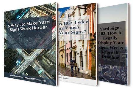
Get PDF Versions
If you would like a set of pdfs sent to you, so you can read them later, have copies for your files, and use as training for your volunteer team, request them here, and we'll zoom those babies right out to you!
Super! We'll Send Them to Your Email Address Right Away!
And now, back to our thrilling story, and how you get 3 times the voters responding to your yard signs …
A New Slant On Yard Signs
5) There’s one more thing you can do to make your yard sign stand out, although rarely used.
IF your name and layout permits it, slant your Last Name about 15 degrees. The slant should be rising UP, not down. (Depressed person’s handwriting usually slants down; happy person’s handwriting usually slants up.)
Lawn Sign with Slanted Text
It’s not the direction of the slant that makes it stand out. It’s just the fact that now it’s different from all the other yard signs. Our minds automatically notice things that are different. Just that simple. Slant your name about 15% and it will stand out more. (Now in some cases, economy with the layout, or other design considerations might suggest normal horizontal layout, but be aware of this option.)
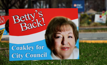
Hey, Betty. Nice to see you back.
Fix-It-Up Example: Let’s Rehabilitate the David Miner Sign
And now that we’ve observed what works well and what works poorly, can we apply this information to make YOUR yard signs work harder for you? Let’s just take a look and see if we can take a 97-pound weakling yardsign and turn it into a real Contender. Let’s rehabilitate the David Miner yard sign!
Step 1. The original design of the David Miner sign …
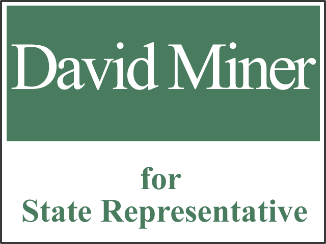
An Approximate Mock-Up of the Original Yard Sign
Step 2. Use Only Lastname and Watch What Happens …
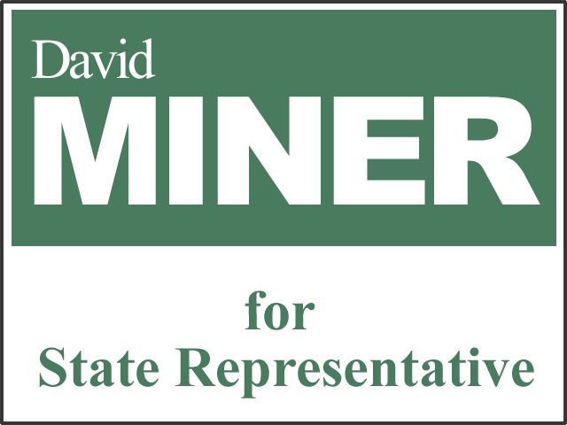
Now When We Use Lastname Only, We Can Make it Real Big, Visible from Way Down The Block. (This also allows the Pre-Existing Meaning of the Lastname to Become Obvious.)
Step 3. Darken the Background Color …
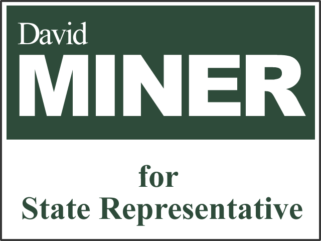
When We Darken the Background Color, We Get Greater Contrast, Which Makes White Letters Stand Out Better.
Step 4. Slant the Name about 15% …
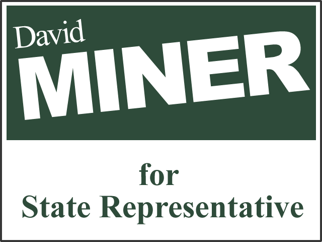
Finally, We Violate the Viewer’s “Expectations” with a Slant. Makes the Name Stand Out Even More.
Now Let’s See How it Worked …
Yards Signs with David Miner Sign – BEFORE
Yard Signs with David Miner Sign – AFTER
Now, if YOU were David Miner, which sign do you think is working harder, being seen more, creating more name recognition among voters? In other words, which yard sign design would YOU use?
The Value of Ten Minutes and a Phone Call
I could say, “just my two cents,” so as to be all humble and all.
But I think that a phone call with your graphics person requesting the printouts as described above, and ten minutes with scotch tape and a wall, will be worth more like $2,000 and up … in terms of how many voters are actually impacted to better name-recognition, and therefore more votes for you, from your yard signs. And who knows, maybe it’s even worth the election.
It’s a simple matter, but when you’ve seen it once, you’ll see it forever.
In this coming election, keep your eyes peeled and you will see other folks’ yard signs that would have been SO much better had they known how to do this. And let’s hope that the candidate with the absolute worst yard sign in town … is your opponent.
🙂
Best wishes for Getting Yourself Elected,
— Arthur Cronos
WATCH THIS SPACE … Coming Next Week:
“How Smarter PLACEMENT of Your Yard Signs Can Triple Their Impact!”
This original article is from http://GetYourselfElected.com …
http://elected.adopsis.com/5-ways-make-yard-signs-work-harder/